It's Not So Hopeless
It's Not So Hopeless
Apart from mere information design, we were to plunge into setting up VizLib (a product set to extend the native functionality of Qlik Sense) and we reinforced the team with specialists from BI Consult, dedicated guys from St. Petersburg. We started the project willingly and with plenty of zing.
February 24 and further events in Ukraine affected the team's drive, it is difficult to keep the mood and develop style guides when people die. Of course, we brought the project to fruition. Despite the background, there is a lot of creativity and cool finds, so it would be wrong not to talk about it. Perhaps it will inspire you to do similar work: it could make clickers see that not only Tableau can be used to make premium visualization, and steer BI heads on the right course in terms of design and user experience.

The project tasks can be defined in this way:
- To formulate unified requirements for the report development and their visual design for bi analysts within the company - in fact, to create a standard view of the report and all typical navigation elements and charts
- To create scaling tools in the corporate BI project – a template, theme, guide and visual vocabulary.
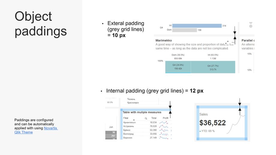
Sequence of procedures
We agreed to run the project in a flexible way - no one knew the limit of Qlik and VizLib's ability to customize individual elements. Development of a complex unified header with navigation features, different variants of the filter panel and buttons posed a particular thread. It was also not completely clear how much formatting could be embedded in a QS JS Theme. In addition, the project was supposed to have a lot of stylistic subjectivity (palettes, chart design). As a result, due to inability to formalize the requirements in detail, we settled the issue amicably – to do 1-week sprints and make decisions within the working group, rather than work formally in the customer-executor paradigm (a highly risky approach, used in certain situations, not suitable for most projects).
I chose - ... miro (subscription extended, work must go on) as the tool for project work – to formalize requirements and collect the result. It’s not the most obvious tool, but I gave it a go. The project implies a lot of remote collaboration from the working team, and the tool is perfect for this purpose. In addition, there was an idea to use miro to design the target document (the guide itself) instead of slides in PowerPoint. We make a miro-board, separating different spaces in it for various content types:
- area for fixing requirements in blocks as and when they are agreed
- planning area - project plan and scrum board (miro has relatively handy templates)
- assembly area for the final result (final slide-like presentation of the guide)
- area of reference artifacts (sample reports, brand books and useful links).
As a result, I can say that it was quite convenient, it can be used in future for lightweight projects.
Step 0. Let's factor out the obvious things - we looked through the brand books and everything that regulates the design in the company, selected the most adequate material. We also went through all presentable and well-known BI guides - the example of such a selection is here.
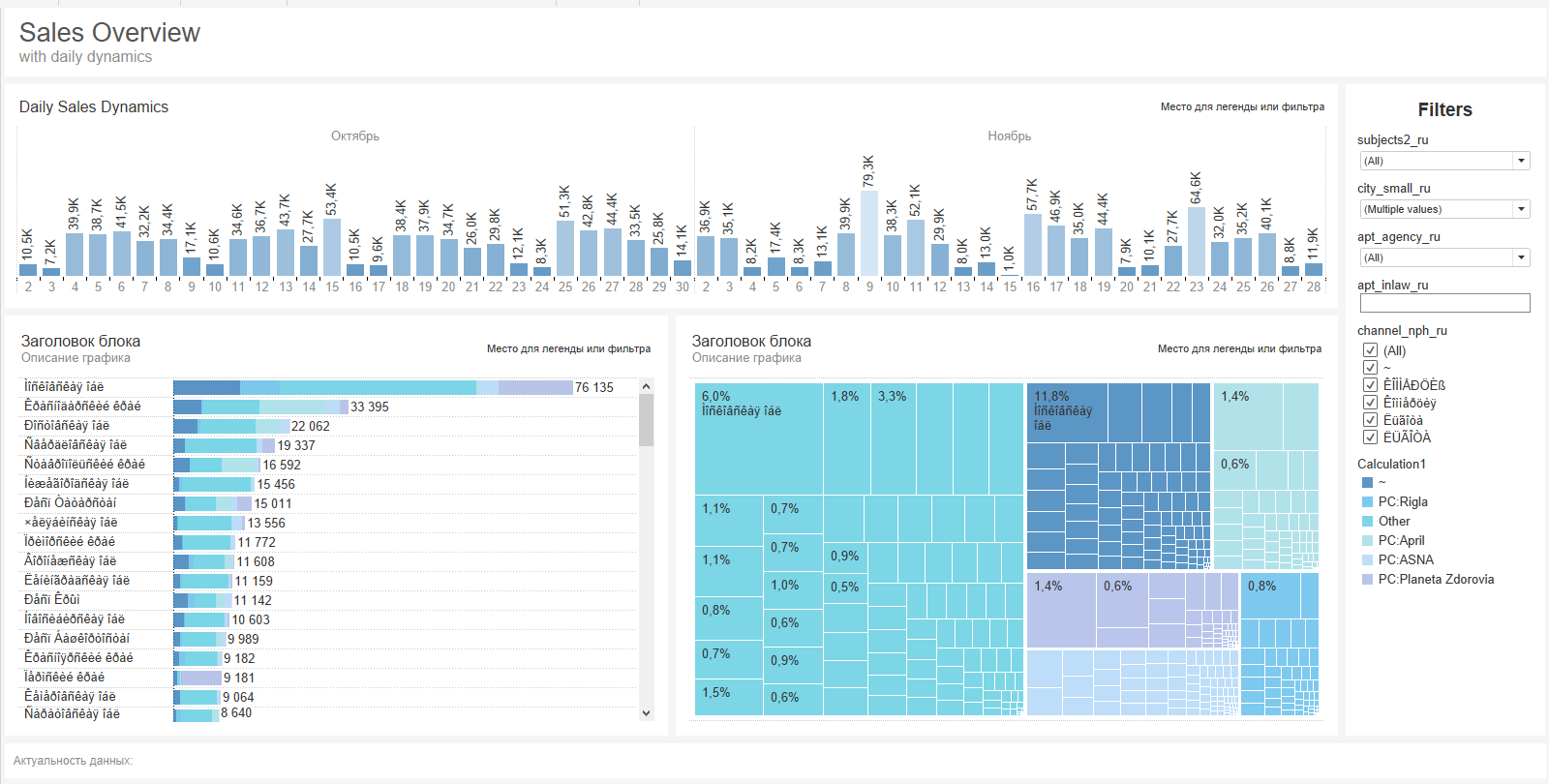
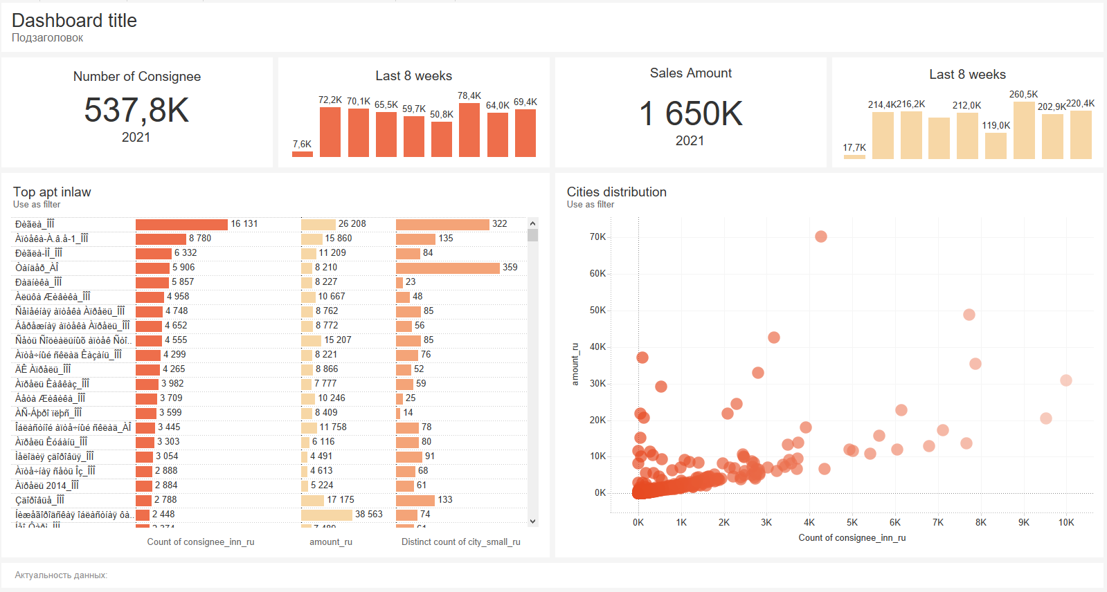
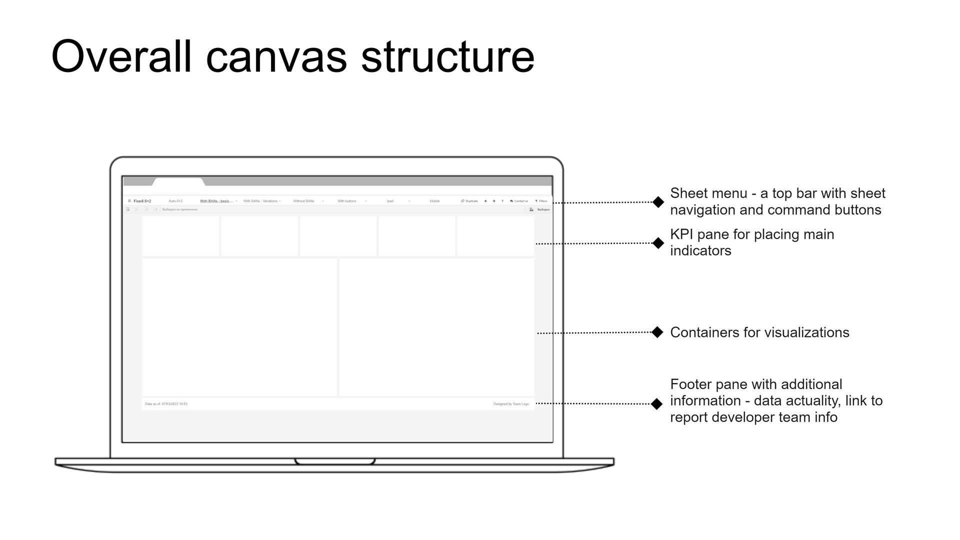
Step 1. The central element in the BI guide is the standardized view of the report - the way you see the basic dashboard layout, the approach to delimiting elements and navigation. This approach has already been formed after many years of working with Tableau. From a number of options, we took the most trendy layout with a gray grid as a basis. But it was not obvious how to employ a sidebar of navigation icons and a filter panel in a click. The pre-estimate was based on the possibility of extending Vizlib Sheet menu in the form of a header.
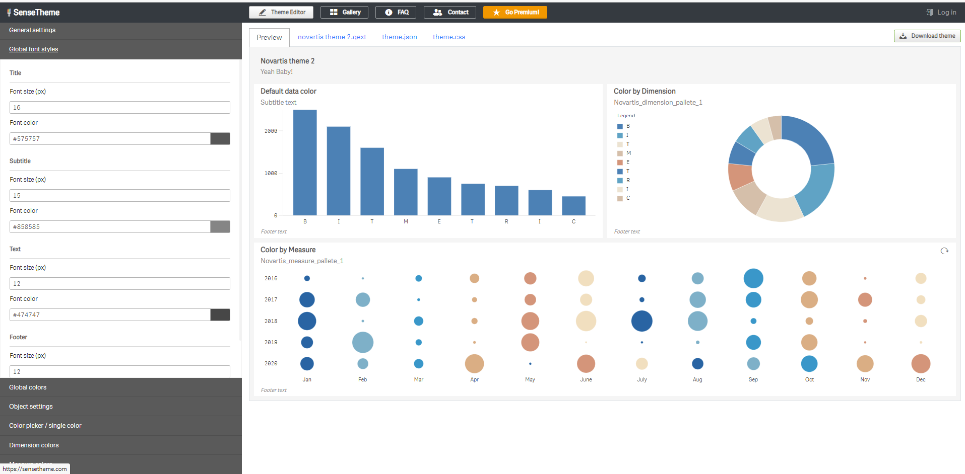
Step 2. We decided to start with a difficult task - create a corporate QlikSense theme. A custom theme in a click is a collection of files (QEXT file, JSON file and optional files like CSS, images, etc.) that help you to promptly override basic formatting - fonts, colors, and padding. In the end, I can say that the QlikSense theme is a great thing which is worth adopting by tableau.
It is important to emphasize that our goal was to stay within the theme capabilities, so that not to add css adjustments, in order to make an easily scalable template..
There are some simple generator programs on that subject to help you set your theme (see sensetheme). At this stage, we confined ourselves to fixing fonts for different types of text, background colors (light gray), object paddings (which eventually create a gray grid), removing all sorts of noise and strokes (be mindful of the data-ink ratio, Roma's article is attached). We also uploaded several test palettes of different types to understand the capabilities. A certain monkey around was devoted to creating color palettes for the guide, the work that I won’t describe. I will only note that I used the coolors service (which fits me the best), and what is more, Qlik also has a useful feature with auto-assigning colors when generating charts in a given priority order, which is often missing in tableau.
During working on the project, we supplemented our theme several times as long as we were creating the visual vocabulary – with formats for axis labels, grid formatting in graphs, hiding excess noise, etc.

Step 3. Another risk for us was that we couldn’t implement navigation using available means - a button bar with various functions that are important to us. Therefore, we started designing the report template. This is a core element of the final product - in fact, a starter empty application for making a new report with layouts for different types of dashboards and customized formatting. The extent to which the template is well-done affects whether it will be time saving and convenient for the developer who reuses it.
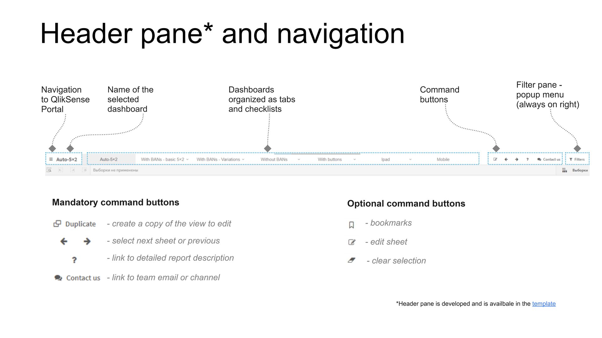
Let's start with the key point - we dismissed the idea of placing the navigation block on the side in no time at all, focusing on the classic concept of a functional header. The space above the click is arranged, to my mind, in a quite stupid manner. The traditional view includes two contrasting toolbars and a third strip with the dashboard title. It’s a weird solution, given that each pixel of the workspace height steals at least two pixels of width.
After multiple squats with the VizLib Sheet Menu, we got a succinct toolbar that contains the report name, dashboard tabs, button icons (required and optional), as well as a button for the drop-down filter panel.
Separately, we designed filter placement in the dashboard body, on the right, as well as the button construction for placing them on the dashboard.

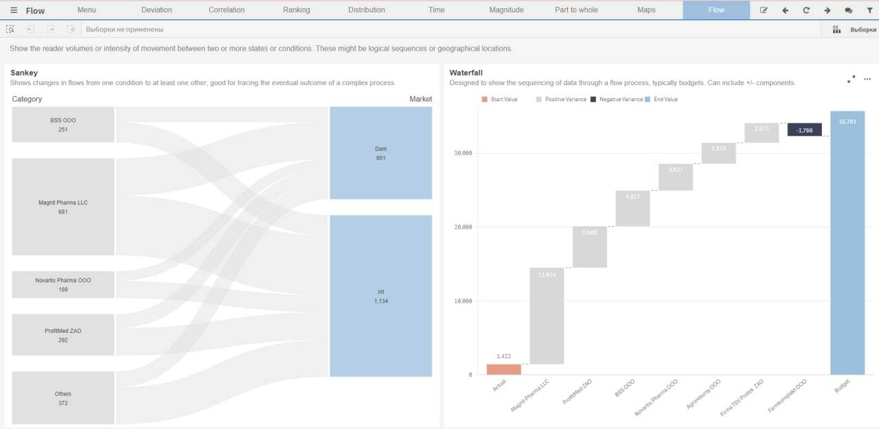
Step 4. Next, a little less challenging, but more time-consuming - creation of a visualization vocabulary - an application containing all the normative implementations of the main and optional charts. The point is to give clear examples of the graph drawing in order to reproduce them in projects, as well as give clear recommendations on how they should or shouldn’t be used..
Here, again, it is important to swallow your pride, and not reinvent the wheel. The subject is well covered for tableau, there is a selection here, there is also no longer new, but cherished guide in Luxoft, half consisting of visual vocabulary. Viz truths are multi-purpose, the main problem is to realize them. Here, the click sometimes has advantages when it comes to charts out of the box.
We based on the work by Richard Speigal from NBS on adapting Financial Times Visual Vocabulary for QlikSense. This dictionary is quite convenient due to its structure and composition. The reuse algorithm is simple - we apply our themes and palettes, allow the content pass through ourselves, add our own content (we added about 30%), refine (and in fact "clear") the formatting of individual charts.
We expanded the standard charts with custom objects: our collection of KPI plates based on Vizlib KPI Designer, as well as tables with sparklines.


Whatever product you develop, don’t multiply ugliness, as we’ve got a shit-ton of it already. In case of limited prospects of the new BI - following the rule of inner and outer in paddings will give you +100 of mana.
Peace and adequacy to everyone.